Let’s build creative strategies that connect, convert, and last.
If you’re looking for thoughtful branding and marketing rooted in strategy and storytelling, let’s collaborate!
-
![]()
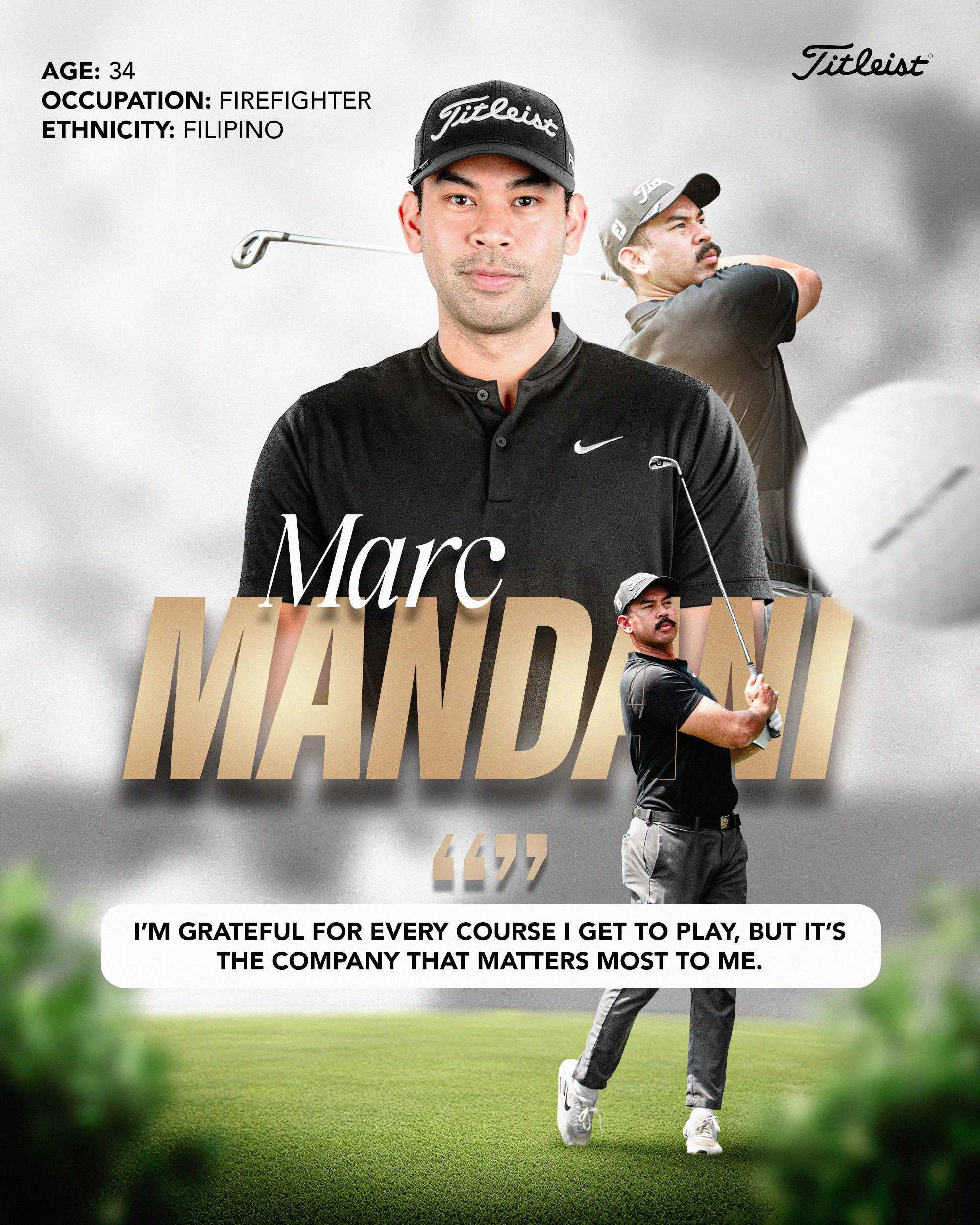
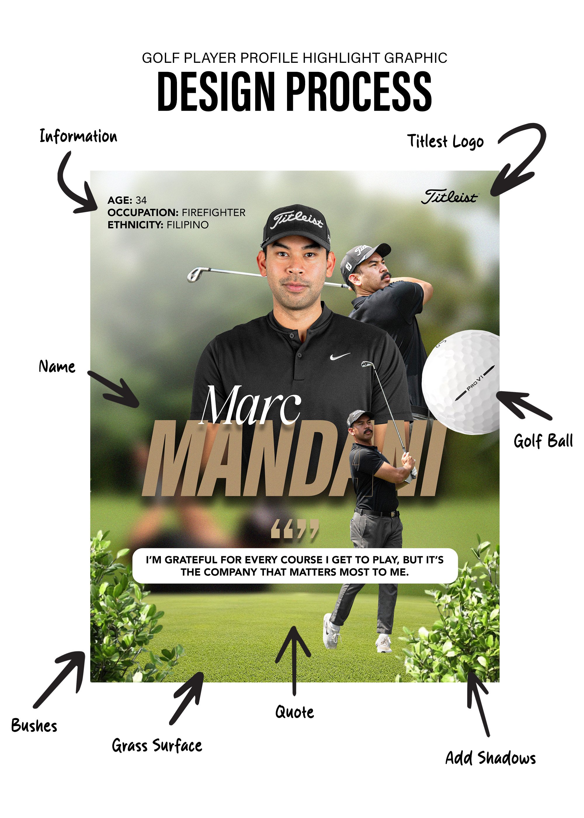
Profile Highlight: Marc Mandani
-
![]()
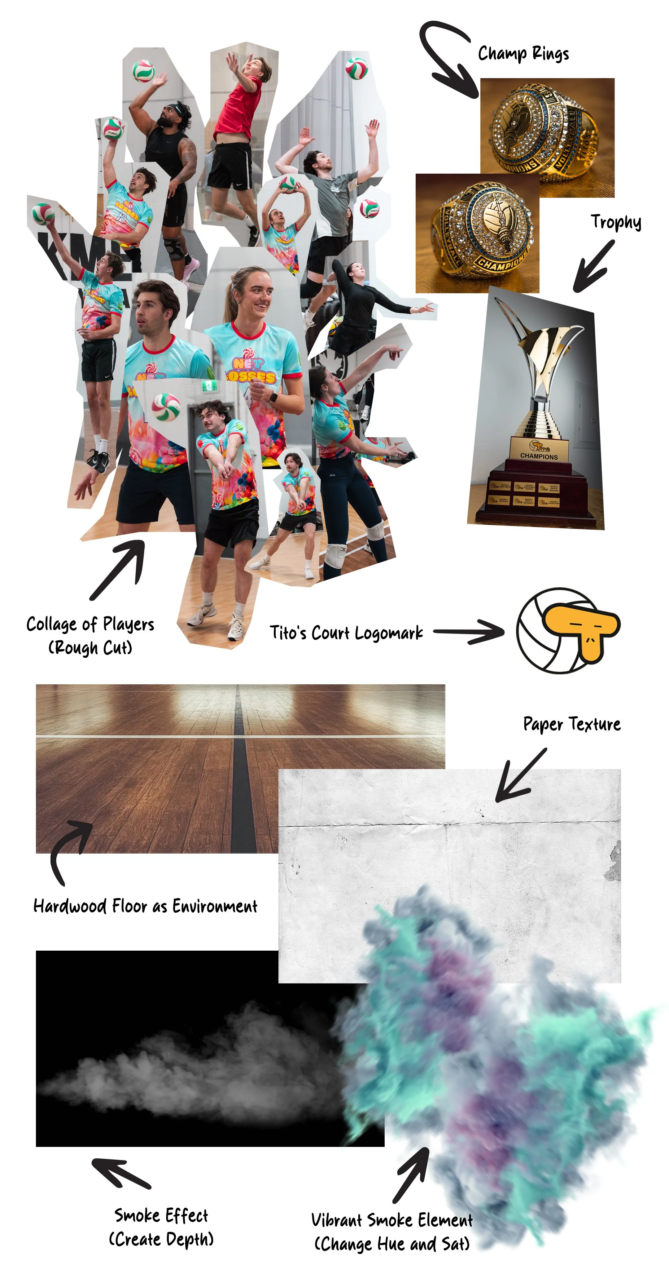
Tito's Court Volleyball League: CO-ED Season 7
-
![Lions Foundation of Canada Dog Guides - Giving Tuesday Campaign Poster]()
Dog Guides: Giving Tuesday Campaign

case study: Athlete Profile Highlight — Golf
This project explores a PGA-style approach to golf athlete storytelling, focusing on clarity, and hierarchy, The design balances a composed portrait with two technical action shots to present both player identity and performance in a single frame.
Typography and layout follow professional golf conventions which is clean information hierarchy, restrained colour palette, and editorial spacing to ensuring the profile feels credible, premium, and adaptable across platforms. A short quote adds human context without distracting from the athlete’s presence.
This piece demonstrates my ability to design within established sports branding systems while delivering polished, story-driven visuals suited for professional golf environments.
To ensure authenticity, I collaborated with a friend (Marc Mandani) and coordinated both on-course and studio shoots. We captured action footage and environmental photos during a live round of golf to reflect natural play and movement, followed by a separate studio session to create a controlled, high-quality headshot for the primary profile image.
This dual-shoot approach allowed me to balance technical performance visuals with a polished editorial portrait, aligning with professional golf profile standards.
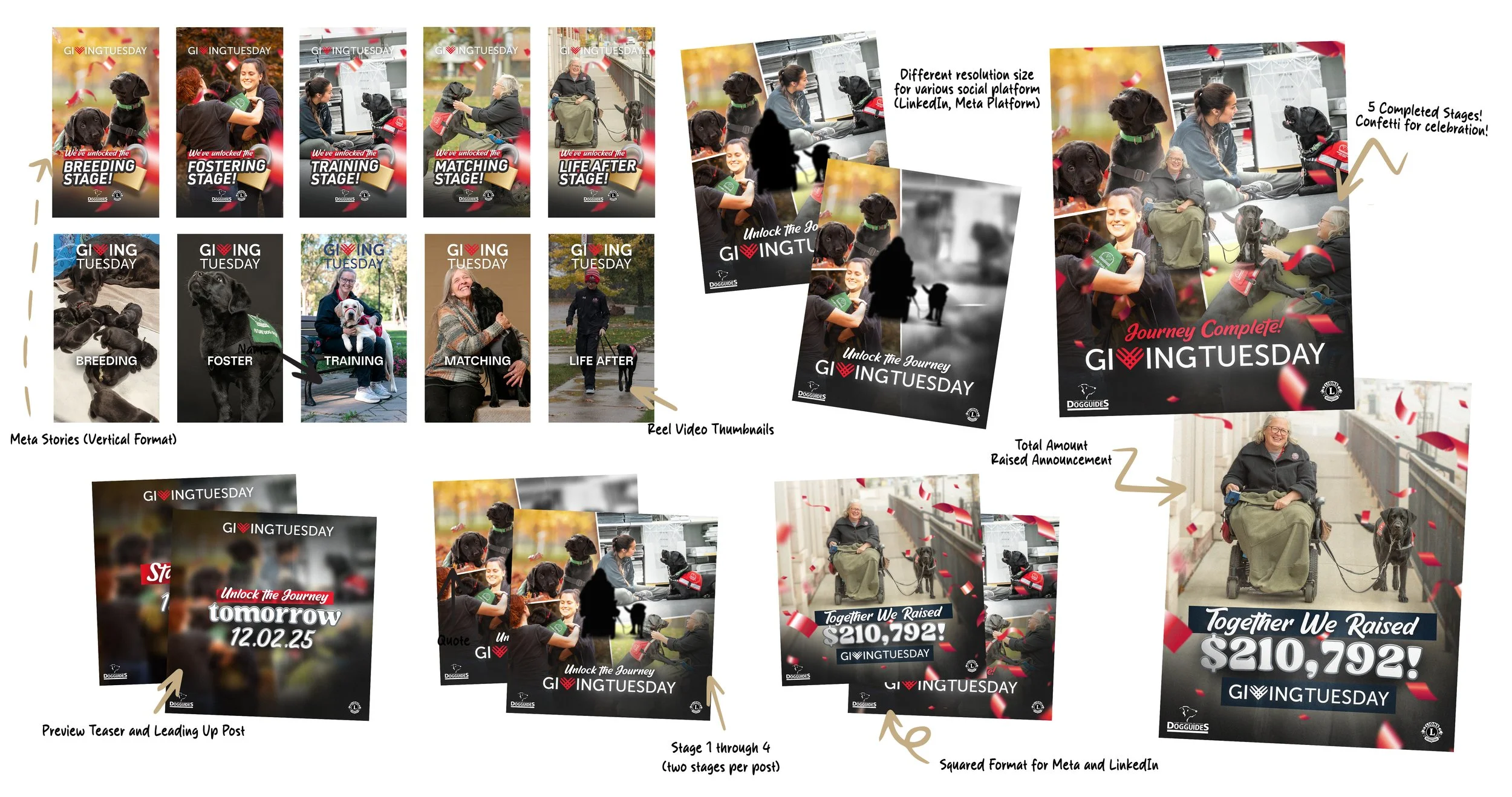
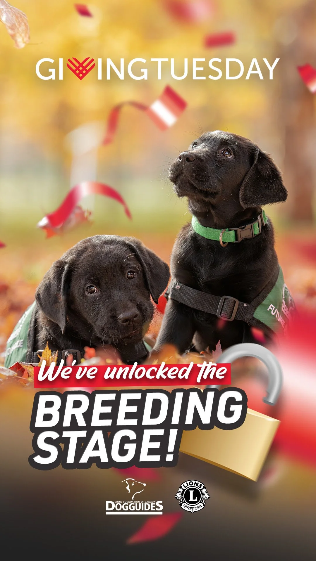
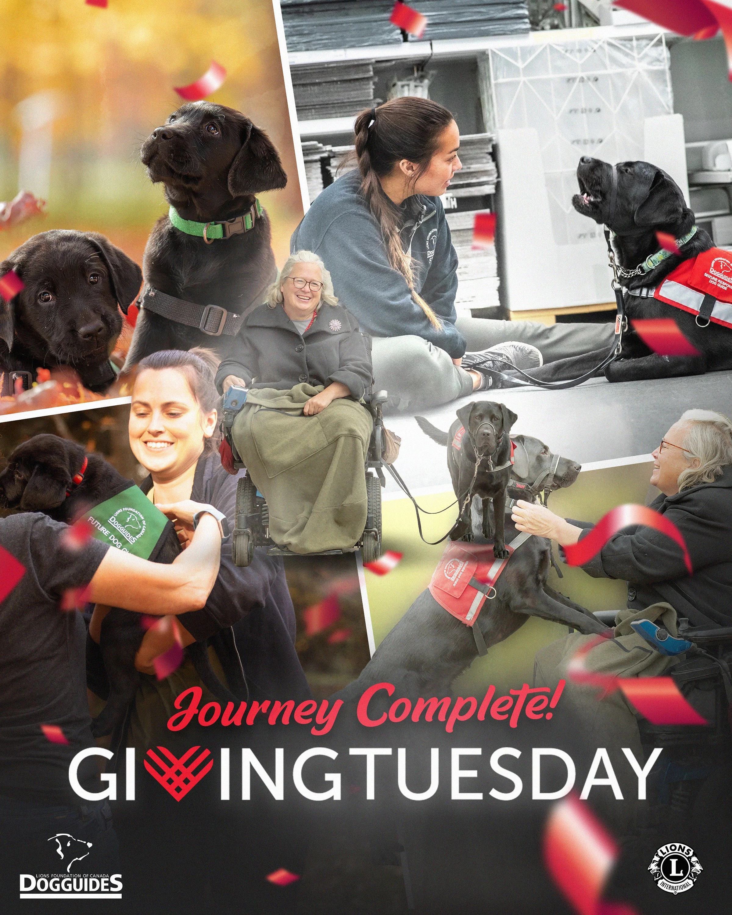
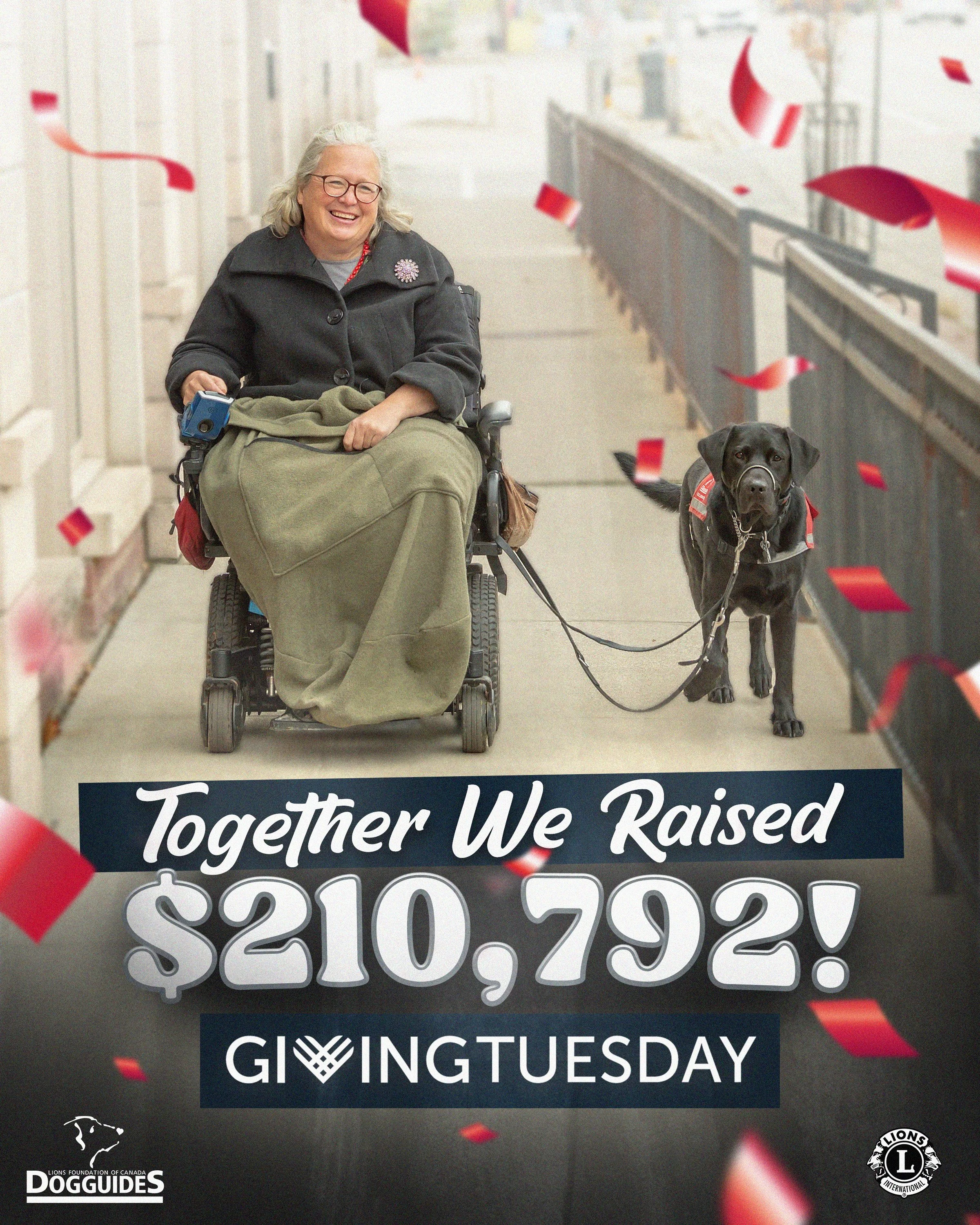
Campaign Overview: dog guides of canada: Giving tuesday campaign — “Unlock the Journey of Dog Guides”
Organization: Lions Foundation of Canada Dog Guides
Role: In-House Graphic Designer / Video Producer
Campaign Type: Integrated Digital Fundraising Campaign
Duration: Nov 18 – Dec 2 (Giving Tuesday)
Project Summary
“Unlock the Journey of Dog Guides” was a multi-phase Giving Tuesday campaign designed to guide audiences through the full lifecycle of a Dog Guide using emotional storytelling, milestone-based reveals, and real-time impact updates to drive engagement and donations.
Over 24 hours, the campaign raised $210,792, generating 46K+ video views across Facebook and Instagram, reaching 55K+ email subscribers, and achieving 6M in earned media reach through coordinated storytelling and real-time content updates.
The campaign was built as a modular visual system, allowing assets to evolve across stages while remaining immediately recognizable. Content was delivered across Meta platforms, LinkedIn, web, email, and video (also filmed and produced all video assets created my myself along with my manager for revisions and approvals, with formats adapted for stories, reels, feeds, and impact announcements.
Key Creative & Execution Challenges
Scaling one idea across dozens of assets
The campaign required consistent execution across multiple formats, aspect ratios, and timelines often updated in real time on Giving Tuesday without visual drift.
Maintaining narrative clarity over time
With five story stages released sequentially, it was critical that each asset felt like part of a single journey rather than isolated posts.
Designing for both emotion and performance
Assets needed to balance heartfelt storytelling with clear calls-to-action and fast readability in high-traffic social feeds.
Where the Campaign Excelled
Strong, repeatable campaign system
A clear design framework (typography, photography treatment, colour palette, confetti motif, and layout hierarchy) allowed for rapid asset creation while maintaining consistency across: Vertical Stories, square feed posts, reel thumbnails, teasers, unlocks, and final impact announcements.
Clear progression through visual cues
Each stage was visually distinct yet systemized, helping audiences intuitively understand where they were in the journey and what would unlock next.
Platform-aware design execution
Assets were intentionally resized and restructured - not simply cropped - to perform natively across Meta and LinkedIn, reinforcing professionalism and attention to detail.
Cohesive close to the campaign
Final “Journey Complete” and total-raised graphics carried the same visual language as early-stage assets, reinforcing trust, transparency, and celebration at the campaign’s peak.
the Outcome
The campaign concluded with a unified visual story that clearly communicated impact and donor contribution, culminating in a strong total-raised announcement. The asset system allowed the organization to move quickly on Giving Tuesday while maintaining brand integrity and emotional resonance.
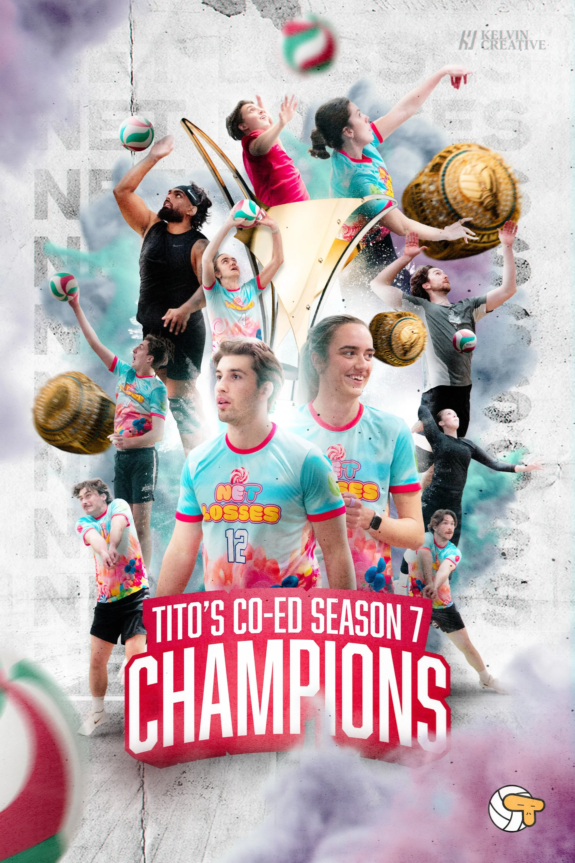
client Project Overview: Championship Announcement Poster
Project: Tito’s Co-Ed Volleyball League — Season 7 Champions
Deliverable: Digital Announcement Poster and Weekly Photo Album
Role: Graphic Designer, Photographer
Timeline: 10-week league season → championship announcement
Overview
This poster was designed to announce the Season 7 Co-Ed Volleyball League Champions, celebrating the team’s achievement through a bold, high-energy visual moment. The goal was to create an announcement that felt victorious, personal, and memorable, following the team’s vibrant colour scheme. while showcasing the collective effort of the team across an entire season.
The final piece brings together photography captured throughout the 10-week league, transforming individual game moments into a unified championship narrative.
Creative Concept & Foundations
The core design foundation centred on movement, momentum, and celebration. Volleyball is fast, dynamic, and expressive — the visual language needed to reflect that same energy.
Key creative pillars: Collage-driven storytelling to represent the full team, not just a single hero moment. Layered composition to convey motion, depth, and intensity. Bold typography to anchor the announcement and emphasize achievement. Vibrant colour treatments to elevate excitement and championship pride
The collage approach allowed multiple moments, expressions, and plays to coexist — reinforcing the idea that every player contributed to the win.
Design Execution
Composition & Layout: Built a central focal structure that guides the eye upward and outward, mimicking the arc and motion of volleyball play. Balanced large hero figures with smaller supporting moments to create depth and rhythm. Used overlapping elements and scale variation to maintain visual energy without clutter.
Typography: Strong, condensed headline typography was chosen for “CHAMPIONS” to convey authority and impact. Supporting text (“Tito’s Co-Ed Season 7”) reinforces context without competing with the primary message. Typography placement anchors the collage and provides visual stability against the motion-heavy imagery.
Colour & Texture: A vibrant, high-contrast palette was used to amplify excitement and separate players from the background. Textured overlays and subtle grit were added to give the piece a poster-like, celebratory finish, avoiding a flat or overly polished look. Team jerseys and league colours were preserved to maintain authenticity and brand recognition.
Photography Integration: All player imagery was captured over the course of the season, then selectively masked and composited to maintain consistent lighting, scale, and direction. Action shots were prioritized to highlight athleticism, teamwork, and emotion rather than static poses.
Outcome & Impact
The final poster successfully: Delivered a clear, bold championship announcement to celebrate the entire team, not just individuals. Created a shareable, high-impact graphic suitable for social and digital platforms to elevate a community sports moment into a professionally branded visual asset. The design resonated strongly with players and the league, serving as both a celebration and a keepsake for the season.
Reflection
This project highlights my approach to graphic design as storytelling through composition — blending photography, typography, and colour into a cohesive visual narrative. By treating the poster as more than an announcement and leaning into energy, emotion, and design foundations, the final piece captures the spirit of competition and teamwork that defined the season.